amtrak
art direction master ii project
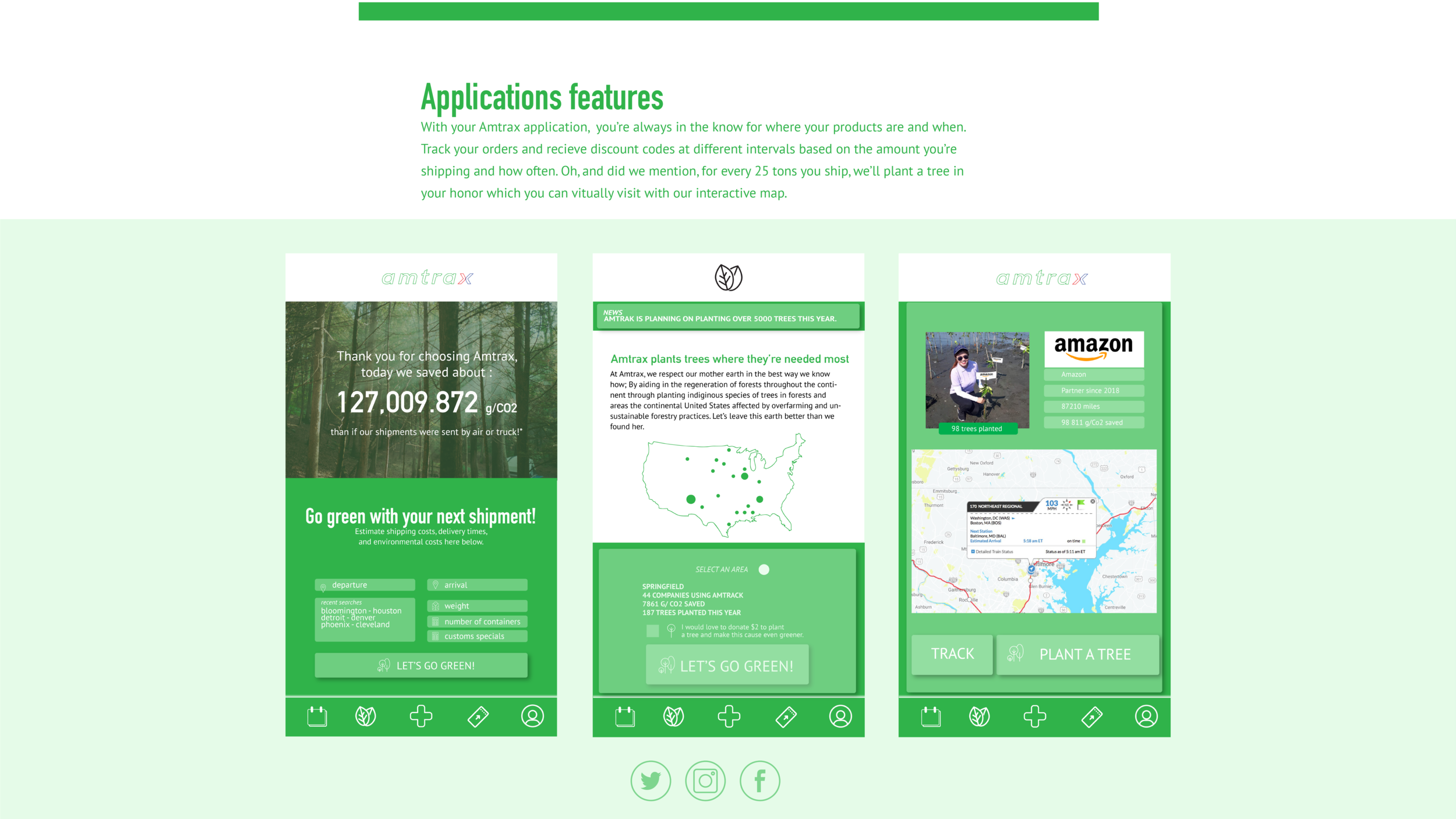
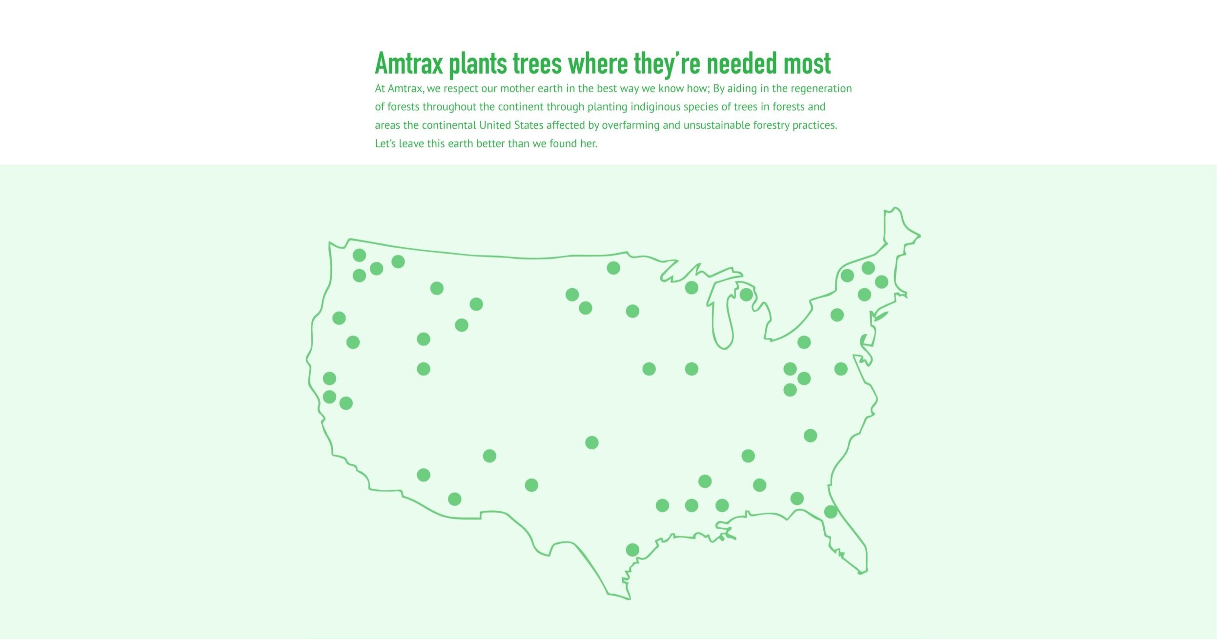
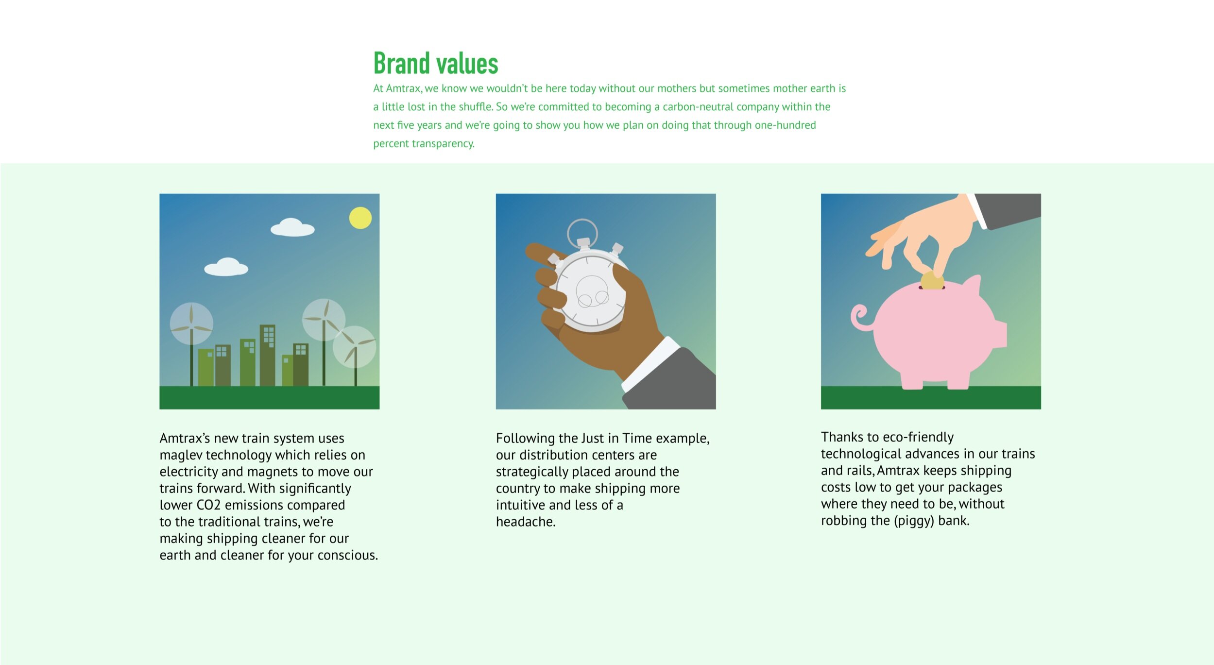
redesign of the visual identity of an institutional brand. the new brand identity keeps the iconic blue and red colors associated with amtrak and it’s american audience while updating its image to remain current in more environmentally conscious times and reflect these new brand values. the name amtrak changes to amtrax, reflecting the company’s network throughout northern america. the final letter ‘x’ of the new brand name is separated to form two arrows of a compass, representing the company’s eastern and western reaches on the continent. the new amtrax shifts its focus from passenger travel to freight shipping and announces it’s new brand values, green initiative, and visual identity via web, mobile, and print.
/
©2018-2022 connie pulliam


